[ad_1]

Aurich Lawson | Getty Images
I am not a data scientist. And while I know my way around a Jupyter notebook and have written a good amount of Python code, I do not profess to be anything close to a machine learning expert. So when I performed the first part of our no-code/low-code machine learning experiment and got better than a 90 percent accuracy rate on a model, I suspected I had done something wrong.
If you haven’t been following along thus far, here’s a quick review before I direct you back to the first two articles in this series. To see how much machine learning tools for the rest of us had advanced—and to redeem myself for the unwinnable task I had been assigned with machine learning last year—I took a well-worn heart attack data set from an archive at the University of California-Irvine and tried to outperform data science students’ results using the “easy button” of Amazon Web Services’ low-code and no-code tools.
The whole point of this experiment was to see:
- Whether a relative novice could use these tools effectively and accurately
- Whether the tools were more cost-effective than finding someone who knew what the heck they were doing and handing it off to them
That’s not exactly a true picture of how machine learning projects usually happen. And as I found, the “no-code” option that Amazon Web Services provides—SageMaker Canvas—is intended to work hand-in-hand with the more data science-y approach of SageMaker Studio. But Canvas outperformed what I was able to do with the low-code approach of Studio—though probably because of my less-than-skilled data-handling hands.
(For those who have not read the previous two articles, now is the time to catch up: Here’s part one, and here’s part two.)
Assessing the robot’s work
Canvas allowed me to export a sharable link that opened the model I created with my full build from the 590-plus rows of patient data from the Cleveland Clinic and the Hungarian Institute of Cardiology. That link gave me a little more insight into what went on inside Canvas’ very black box with Studio, a Jupyter-based platform for doing data science and machine learning experiments.
As its name slyly suggests, Jupyter is based on Python. It is a web-based interface to a container environment that allows you to spin up kernels based on different Python implementations, depending on the task.

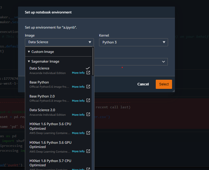
Examples of the different kernel containers available in Studio.
Kernels can be populated with whatever modules the project requires when you’re doing code-focused explorations, such as the Python Data Analysis Library (pandas) and SciKit-Learn (sklearn). I used a local version of Jupyter Lab to do most of my initial data analysis to save on AWS compute time.
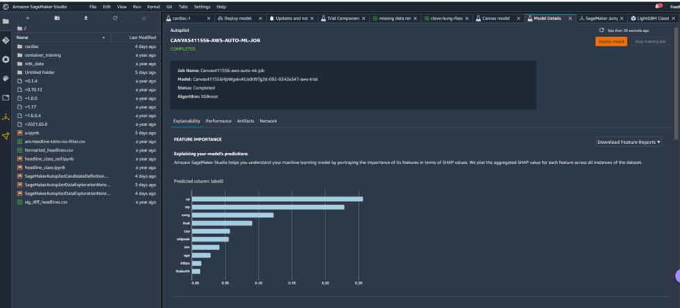
The Studio environment created with the Canvas link included some pre-built content providing insight into the model Canvas produced—some of which I discussed briefly in the last article:

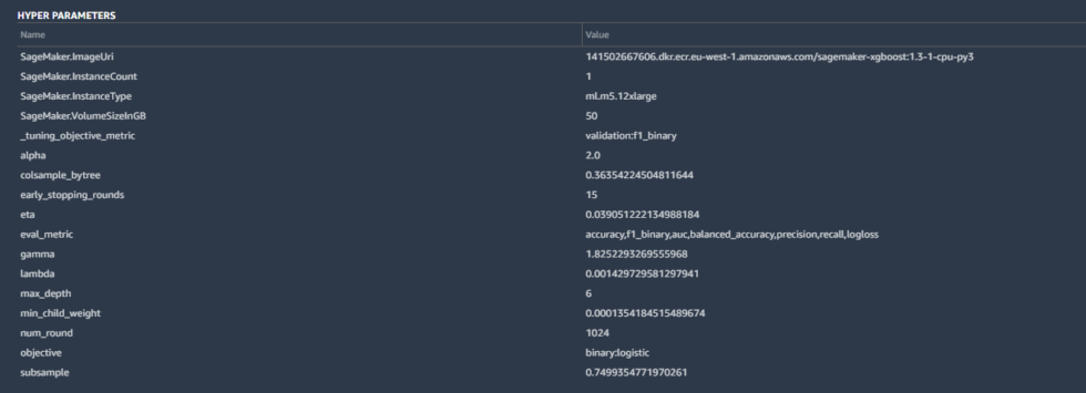
Some of the details included the hyperparameters used by the best-tuned version of the model created by Canvas:

Hyperparameters are tweaks that AutoML made to calculations by the algorithm to improve the accuracy, as well as some basic housekeeping—the SageMaker instance parameters, the tuning metric (“F1,” which we’ll discuss in a moment), and other inputs. These are all pretty standard for a binary classification like ours.
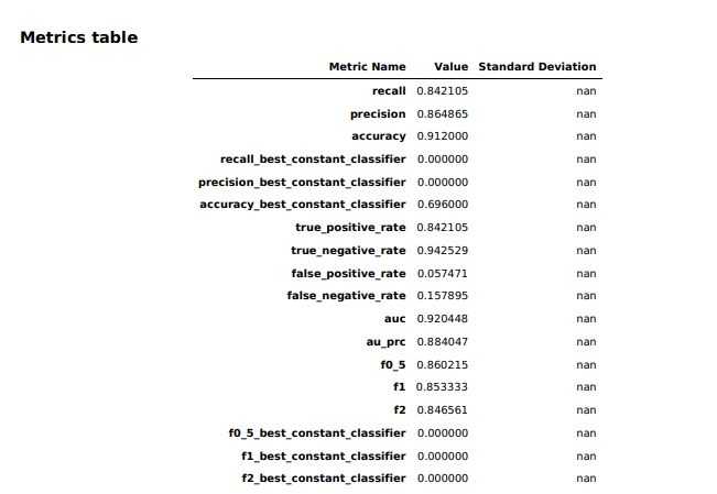
The model overview in Studio provided some basic information about the model produced by Canvas, including the algorithm used (XGBoost) and the relative importance of each of the columns rated with something called SHAP values. SHAP is a really horrible acronym that stands for “SHapley Additive exPlanations,” which is a game theory-based method of extracting each data feature’s contribution to a change in the model output. It turns out that “maximum heart rate achieved” had negligible impact on the model, while thalassemia (“thall”) and angiogram results (“caa”)—data points we had significant missing data for—had more impact than I wanted them to. I couldn’t just drop them, apparently. So I downloaded a performance report for the model to get more detailed information on how the model held up:

[ad_2]
Source link

